
Project Safe
Non-Profit Redesign
Project Safe Non-Profit Redesign
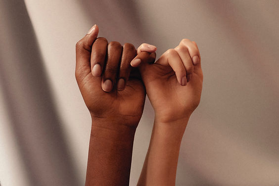
Project Safe is a 501c3 nonprofit organization working to end domestic violence through crisis intervention, ongoing supportive services, systems change advocacy, and prevention and education. Project Safe’s primary service area is Madison County, Oconee County, Clarke County, and Oglethorpe County, but provides services to people from all over Georgia.


OUR TEAM
Morgan Smith
Joelle Gregory


Role
Lead visual & UX/UI design.
UX Researcher
Timeline
3 weeks,
October 10 - October 31
Tools
Figma, InVision,
Adobe Illustrator, Miro
The Challenge
We observed that users who were in need of immediate help or resources had needs that could not be met by the website's current interface.
The Solution
Clearly outline the goal and purpose of the organization and offer more call to action fields for both those wanting to help and those in need.
Research
We started off by doing a conducing a survey, with over 30 people ranging from ages 15 to 50 filling out the form. Here's what we found:
54.2%
62.5%
50%
of users visit non-profit websites to find out more about that organization.
of users are attracted to a website's aesthetics and usability, respectively.
look to Google to find help in private situations while the other 50% go to a professional.
We also discovered that most users associate the colors purple and light blue
with feelings of safety and calming.
User Interviews
We conducted 4 user interviews asking questions on usability,
non-profits, and crisis intervention.
How would you go about looking for help in private situations?
"Get in contact with someone knowledgeable/trustworthy, look on the internet and conduct research."
What initially attracts
you to a website?
"Aesthetics, reputation, and organization/functionality of the site."
When visiting a non-profit website, what are your intentions?
"How to donate, find out more about the organization, finding out how to get involved."
So what does this mean? - User Insight Statement
Individuals impacted by domestic violence and those who support ending domestic violence need an appealing non-profit website with thoughtful and seamless navigation because when visiting a website, usability is highly imperative to the user finding their information quickly and an aesthetically pleasing website gains their interest.
During the survey, we discovered that 54.2% of users visit non-profit websites to find out more about the organization. Further we discovered, 62.5% and 58.3% of users are attracted to a website's aesthetics and usability,respectively.
Therefore, we believe that users need a website that is aesthetically pleasing and easy to navigate so they will visit to find out more about the organization and that we might be able to help if we focus our redesign on building an attractive interface that is easy to use.
We might do this by investing in a color scheme that is well-suited for organizations dealing with domestic violence, redesign the navigation to have quick ways to exit the site, and build the homepage to indicate the purpose of the organization. Doing this will allow our product to gain more frequent use and be of more help to all users.
User Interviews
Based off of the information collected through surveys and interviews, we put together a user persona for our intended audience. Meet Taylor Wood!
Areas for Improvement

User Journey Map
Let's look more into Taylor and her reasonings behind visiting Project Safe.

Success Criteria
Clarify
Clarify the main goal of the
organization on the home page
of the website. Add mission
statement and more calls to
action.
Simplify
Reduce the amount of extra
information and clutter.
Safety
Incorporate a "safe exit" feature
in case of emergency or
dangerous situation. Add hotline
information and other help options.
Sketches
Sketching out my ideas was very helpful in figuring out the information architecture and how to block out the specific information.
To create an webpage that users like Taylor can easily accomplish their tasks and find out any additional information Project Safe, I brainstormed and sketched many possible screens and option to make it easy to navigate. I ultimately settled on this sketch, I wanted to embody feelings of safety and comfort through comforting imagery and blues and purples.

Lo-Fi Wireframes
Translating our sketches into Figma, I created 4 main screens to maintain the overall feel and main elements of the website while hitting the success criteria I previously determined.


Comparison
I designed the landing page to maintain their color scheme and mission statement, but replaced the amount of information thrown at the user initially with a "Learn More" button. I also focused on reducing the amount of tabs to the main action points.
Before
After
User Testing
Using my sketches as a low-fidelity prototype, I conducted a few interviews with some special people.
Meet Jasmine!
Jasmine is a newly promoted General Manager for her local supermarket. With new new promotion, she is looking for ways to give back to her community. I asked Jasmine to give me her opinions on the wireframes! Here's what she had to say:
"The design is beautiful, I love the colors in the back and it feels very welcoming. As someone who is always looking for ways to give back, the volunteer opportunities tab is great."
"Are you going to be adding anymore pages?"

Hi-Fi Wireframes
Based on my interview with Jasmine, I realized that the majority of users would be looking for ways to help instead of looking for help themselves, therefore we focused on the Volunteer Opportunities and Donation options for users to help in their own ways.

We asked Jasmine to click through the prototype, here are her thoughts:
"It looks great! I like the layout for the volunteer opportunities, it's super helpful to see all the options displayed in a list like this."
User Feedback - Hi again, Jasmine!

Reflection
This project was definitely the most challenging, yet most rewarding out of all of the ones I worked on for my bootcamp. Being on a team of 2 instead of the suggested 5 and the quick timeline meant that we had to move pretty quickly through all of the research, testing, and design process. It was important to me to make sure we didn't rush through or bulldoze over any important details.
Areas for Improvement
-
Iterate more on the pages to offer more diversity in style. Add a "Who are we" section to the home page to add faces to the organization in order to offer a more personal touch.
-
Conduct more research on the commerce side, focusing more on the thrift shop
portion of the organization.
-
Given more time, I would want to add more features to the donate section such as an option where the user could set up a time slot to donate clothes or other necessary goods.